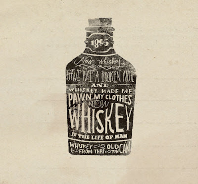
These are a series of typographic pieces I found particularly inspirational
A poster featuring a poem about drinking. Really nicely composed into the shape of the whiskey bottle. I love the vintage hand-drawn feel of the piece, it's quite quirky and ties in with classic poster styles for alcohol products. The typefaces they've chosen resemble those found on old bottles of whiskey. Also the way it has been rendered looks to be some sort of lino print. Even this technique could be used when creating my final pieces for this brief.
This poster for Empire Strikes Back uses a clever concept of having a calligram made up of quotes from that film. As apposed to previous calligrams I've looked at, this design features an arrangement of lines of type instead of random letters. This is achieved by having the type running horizontally or vertically and not in all different directions. The size of the type for each line is also consistent, thus the text in this poster is legible to a greater degree. It is also designed in a way that it doesn't need to fill every crevasse of the outline, rather it fills the image to the point where each line fits and is legible. This could be a useful technique when it comes to creating my final piece for this brief.
I like the simplicity of this piece. I like the way the designer has highlighted certain words in the quote by giving them a whole line to themselves or by making them larger than the rest. This makes certain words like 'happiness' more striking and powerful. A simple use of typographic hierarchy that could be incorporated into my designs.


No comments:
Post a Comment