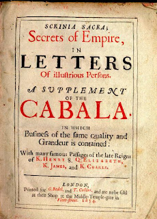
In order to bring in more elements of 18th century style type into the Wordsworth design I had a look at more posters from that era. I want to pick up on some of the old style letter or number designs, or any glyphs I could add just to give the poem a more oldstyle feel.
One thing I picked up on is the oldstyle numbers that obviously had ascenders and descenders back then.
I found the glyphs window in Illustrator and under the "oldstyle symbols" tab I actually found the classic numbers in the Minion Pro typeface. I thought it would be a good idea to include the poet's name and year it was written and that I could write the year using these oldstyle numbers.
I also found a variety of other glyphs that look similar to those found in 18th century texts. I quite like the one above. I thought it'd be nice to add a few glyphs at the bottom next to the poets name as decoration, referencing the way these classic posters were decorated.
This is what I went for as the end result.


No comments:
Post a Comment