
Wednesday 19 October 2011
Further Kerning
Aligning and Kerning

- Aligning the type in relation to the vertical center line. I chose 'strong' and 'sedate' as the basis for this as visually that whole left side appears right aligned in the way it's laid out. 'Serene' to 'Swift' leads into the center whilst "Violence" to "Great" is leading out from the center. This gave the type a reason to sit there and balances out the design nicely.
- Adding the quoter's name. I chose to align the ascender line of "Matthew Prior" to the baseline of "Great." whilst also aligning it with the last quote mark. This stops the type floating aimlessly on the page and establishes a clear relationship between the quote and the quoter. It's also positioned to lead straight off from the quote once the viewer has read it.
- Changing the background colour. I chose a more vibrant blue just to give the design more energy and make it more eye catching. The blue before was quite washed out I thought. This ties in well with the context of the quote as it describes lots of quite energetic characteristics of the Thames.
- Kerning the letters to tighten up the overall shape and stop letters from appearing like they're floating away.
Old style Glyphs


In order to bring in more elements of 18th century style type into the Wordsworth design I had a look at more posters from that era. I want to pick up on some of the old style letter or number designs, or any glyphs I could add just to give the poem a more oldstyle feel.

One thing I picked up on is the oldstyle numbers that obviously had ascenders and descenders back then.

I found the glyphs window in Illustrator and under the "oldstyle symbols" tab I actually found the classic numbers in the Minion Pro typeface. I thought it would be a good idea to include the poet's name and year it was written and that I could write the year using these oldstyle numbers.

I also found a variety of other glyphs that look similar to those found in 18th century texts. I quite like the one above. I thought it'd be nice to add a few glyphs at the bottom next to the poets name as decoration, referencing the way these classic posters were decorated.

This is what I went for as the end result.
More ideas


With the type itself I chose to set it in Helvetica as this typeface is well known for being clean straight-forward and subtle. The only things I've done to the words is set the word "flow" in italic to imply the movement of the river and "little" in Helvetica light to suggest 'lack of' something (in this case knowledge). I chose to add these touches to add a dash of visual interest to the poem but keeping it very simple and straightforward.
I always got the feeling that this poem represents an after-thought that occurs in someone's mind as they look at the river. That's why I wanted to have this theme of subtlety and space in the design.
I don't know whether to add colour or not. This is something that could easily be set in various locations around the Thames like what I saw with Why Not Associates. It could be engraved or cut into a surface still retaining its style and message. I think if I'm going to continue this theme of minimalism then I don't really need colour as this maintains the subtle tone to the poem and allows the audience to make up their own mind about the poets feelings about the Thames.

Friday 14 October 2011
Further Development

I kerned the words to close up some of the gaps and make the overall shape of the type more solid. I also experimented with using colour to suggest the water flow. After looking at this idea more and more I'm growing less fond of it. I think maybe a change of typeface might helps as the words don't seem to gel as well as I first thought. The shape doesn't really suggest a tranquil flowing river because it's too sharp and angular.
More Ideas for 'Riverside Living'


These are two concepts I've been working on for this extract. The first one focuses on the feeling of insignificance the voice of the poem feels when watching the water. I chose to isolate the last line to suggest a sense of loneliness. I also opened up the kerning as the words progress to suggest that this feeling is increasing throughout the poem. I tried to incorperate a visual that suggests a water ripple. This was an attempt to reflect the continual flow of the water to the audience. But after several tries it seemed the two concepts didn't really gel.
The second design focuses on the "continual flow" mentioned in the poem. The idea was to connect the words in a way that makes them visually flow from one to the other. I chose Gill Sans for the typeface as san serifs work well with this sort of composition. When arranged in this way their simplicity allows the letters to lead on to each other seamlessly. Also Gill Sans is closely reminiscent of typefaces used in signs and advertising around London, such as Johnston for the underground. So it ties in nicely with the idea of London and the Thames.

I like the result of this idea. The connection between the words reflects the continual flow of the river and I was able to adjust the size of the words at the end of the poem to emphasize the fact that they know so 'little'. The decreasing size of the type also reflects the feeling of insignificance as it suggests the voice of the poem feels small in comparison to the endless flowing water. This design still needs quite a bit of development though. The colour isn't particularly appealing and the scale of the poem overall could be altered to better fit the frame. I think the basic structure is fine though.
Wednesday 12 October 2011
Experimenting with Colour


Navy Blue Type / White Background
This was to remind the audience of type printed in that old style ink that was a very deep blue colour. It's also an attempt to keep the design simple and contemporary, which is one of my goals for this piece. However I don't know if it's only slightly less plain than the original black and white.
White Type / Blue Background
This was add a more subtle feel to the type whilst suggesting connotations of the river. But I chose a more pale teal shade of blue as it appears slightly more formal and serious, hopefully reflecting the historical significance of the poem more than a brighter more in your face blue that could undermine the poem. I like this colour scheme but I think A) it makes the exclamations appear more passive instead of eye catching as they're set in white and B) Although the whole idea of using blue to represent the river does have its place, it is a bit cliche and isn't something I want to use in all of my designs. I think there are more meanings to explore through colour with this poem.
Brown and Deep Red Type / White Background
With this colour scheme I experimented with using alternating colours for the type, emphasizing the large outbursts using red in order to bring them out even further from the rest of the poem. Also the red and brown is designed to remind the audience of old 18th century posters (based on the ones I've been researching) which use red to highlight important words and phrases. Often titles. The brown has connotations of old style paper. In this way I can reflect the historical aspect of the poem without directly replicating something I've seen done before. And hopefully these colours, along with the white background, will give the design a more contemporary feel.
Another alteration I made was to the typeface choice. I decided to set the smaller type in Minion Pro and leave the large type in Imprint MT Shadow. This is because the 'shadow' design of Imprint is hard to make out at this smaller scale and it only serves to make the type look needlessly heavy. Minion Pro is a similar roman typeface that carries the same connotations but works well as the main body type for this design because it's not so decorative. Overall the design becomes cleaner and more concise.
Further Development

After the group interm crit I found there were two main criticisms with this piece that came up:
- Quotation marks aren't needed because they reinforce the obvious and crowd the image
- The red is a bit too contrasting with the white and black, and distracts from the rest of the quote.
I've since altered my design removing the quotation marks and inversing the colour and adding a light blue background to represent the water. I played around with the composition and spacing a bit more. I think it now reads well and the effect of the words comes across as you read each word in sequence.
Perhaps the addition of alternating colour to show meanings was a bit of overkill. I think white works because for words like 'serene' and 'sedate' it carries the same connotations of passiveness and grace. I think the increased size and bold weight of words like 'strong' and 'violence' is enough to carry the connotations of aggression and strength without the need of different colours. This simplification of colour use does makes the design more consistent and brings the quote together as a whole.
Monday 10 October 2011
Experimenting with Size

Apart from adding meaning to the words I feel playing with size and composition has resulted in something that looks alot more visually interesting than before. But I have tried to stop it from looking messy or being illegible. I grouped words of the same line together and arranged them so that they sit aligned or create a recognizable block of type.
Overall I feel this is a step in the right direction and has given this quote alot more energy. Further development is needed though.

I also played with a change of typeface. Bookman Oldstyle. The reason for this is the difference between regular and bold. I think bookman in regular has the appearance of a classic serif typeface like Minion Pro whereas as Bookman in bold has the appearance of a hard solid typeface like Rockwell. Regular is useful for words that are associated with grace and delicacy like 'serene' whereas Bold is useful for more aggressive powerful words like 'strong' and 'violence.
Adding Colour

Layout

There's lots of ways to place the type. At the moment I've been experimenting with a fairly basic layout for the quote. I aligned the right edge of all the 'yet's and 'without's in order to emphasize the contrast between the first word and the last and the fact that there's a comparison taking place.
I also might include quotation marks as part of a visual motif. There might be a way to tie it in with the idea of the Thames.
Experimenting with Typeface and Fonts

I found Minion Pro to be a good candidate for this piece. It has a nice range of weights which I can use to change the meaning of each word. It also appears more graceful which reflects words like serene, majestic and sedate.
I also chose to experiment with colour in order to convey messages. I set 'serene' and 'sedate' in a washed out grey in order to make them appear more passive. Whereas words like 'violence' and 'terror' are aggressive powerful words that I thought would be best suited to red which has connotations of danger and fear.
'Swift' was set in italics which suggests motion or speed. I also set 'majestic' in italic except in medium italic. To me the word majestic does suggest ideas of grace and flow but it also suggests ideas of status and importance. I'm not sure if 'swift' and 'majestic' both being in italics means their messages are muddled up.
Concept for Setting the Quote
"Serene yet strong, majestic yet sedate, swift without violence, without terror great."
For this quote I want to focus on the contrasts between each comparison made. I had an idea to use different font weights and styles from one particular typeface to illustrate this. For example 'swift' could be in italic which creates connotations of motion and 'violence' could be in bold or red signifying its aggressive nature.
I've singled out each of the key words in this quote. Before setting this type on the canvas I want to find suitable styles for each word. This involves finding a suitable typeface that not only reflects the overall tone of the piece but has a range of weights and styles to be used for my idea.

Thursday 6 October 2011
Idea for 'Riverside Living' Extract

Wednesday 5 October 2011
Ideas and Experimenting with Type

I noticed the tone of voice of the poem is very passionate and he makes frequent outbursts about his feelings for the beauty and serenity of The Thames. I chose to highlight this fact by setting the exclamations in bold and in their own lines. This use of typographic hierarchy is something I found in my research and looked like it would be effective here. And I really like the effect this creates. The large phrases break up what would otherwise be a long unbroken block of text, which people might loose interest in. Also the fact that they're quite bold powerful statements should make the piece more eye-catching and attract attention from the public.
This poem is more about the poets feelings about the Thames rather than the Thames itself, and I want to communicate this through this piece. Something about the exclamation marks at the end really adds character to the words being said and expresses his passion for the Thames to the audience. Visually these lines jump out at the audience in a similar way as if they were being shouted.
I played around with different typefaces briefly whilst designing this piece. One that I'm quite fond of is called Imprint MT Shadow that has the look of classic roman type, with a slightly decorative feel, which reminded me of the sort of type found in 18th century books and posters. This ties in nicely with the poem as it was written in 1789.


 |
| Imprint MT Shadow. |
I noticed that these 18th century posters that read top to bottom make similar use of typographic hierarchy to emphasize important words and messages. They also feature a mix of roman, humanist and blackletter typefaces which signify different levels of importance or context for each word. I may choose to incorporate a range of type styles as I develop this piece.
Research: Using Type to create Meaning
For this project I decided to read 'A Type Primer' by John Kane. In this book on typography there's a really useful section on setting type on a page in order to create meaning and emphasize different things. I've scanned in some pages I found particularly useful.
Some of the tips included:


Some of the tips included:
- Playing with size in order to add or remove emphasis. Or in some cases show distance or scale
- Positioning a word in relation to the frame in order to create meaning. E.g - The word "hang appears to be hanging from the top of the frame
- Using type play to make sentences more expressive and enforce important words.
- Lining up words to enforce meaning through the relation of those words together in sequence.
- Using space to create pauses in the way the audience reads the sentence. E.g.- "It is better to fail ..... in originality."
- Contrasts in scale and colour can be used for dramatic effect.


Monday 3 October 2011
Typographic Posters for Inspiration
These are a series of typographic pieces I found particularly inspirational
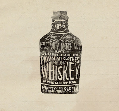 A poster featuring a poem about drinking. Really nicely composed into the shape of the whiskey bottle. I love the vintage hand-drawn feel of the piece, it's quite quirky and ties in with classic poster styles for alcohol products. The typefaces they've chosen resemble those found on old bottles of whiskey. Also the way it has been rendered looks to be some sort of lino print. Even this technique could be used when creating my final pieces for this brief.
 This poster for Empire Strikes Back uses a clever concept of having a calligram made up of quotes from that film. As apposed to previous calligrams I've looked at, this design features an arrangement of lines of type instead of random letters. This is achieved by having the type running horizontally or vertically and not in all different directions. The size of the type for each line is also consistent, thus the text in this poster is legible to a greater degree. It is also designed in a way that it doesn't need to fill every crevasse of the outline, rather it fills the image to the point where each line fits and is legible. This could be a useful technique when it comes to creating my final piece for this brief.
 I like the simplicity of this piece. I like the way the designer has highlighted certain words in the quote by giving them a whole line to themselves or by making them larger than the rest. This makes certain words like 'happiness' more striking and powerful. A simple use of typographic hierarchy that could be incorporated into my designs.


Concrete Poetry and Calligrams
Concrete poetry or Size poetry is poetry in which the typographical arrangement of words is as important in conveying the intended effect as the conventional elements of the poem, such as meaning of words, rhythm, rhyme and so on. It is sometimes referred to as visual poetry, a term that has evolved to have distinct meaning of its own, but which shares the distinction of being poetry in which the visual elements are as important as the text.

This style of poetry is very much related to the brief as I will have to consider setting type in interesting ways in order to engage the public with the poem. For example the above poem by George Herbert entitled "Easter Wings" was printed in 1633 on two facing pages (one stanza per page), sideways, so that the lines would call to mind birds flying up with outstretched wings.

Another example of concrete poetry: 'I, the Lunchbox' set in a way that resembles a lunchbox. Concrete poetry differs from calligrams as the type is designed to vaguely resemble the objects or themes depicted in the poem whilst calligrams feature type set to create a distinct image of something similar to the original.


Calligrams are often alot more elaborate and colourful. I really like how vibrant and eye-catching they are. However calligrams are usually made up of a vast array of letters arranged in all sorts of ways in order to make up the overall image. It may be hard to set lines of type in this way as legibility would be an issue. I am really interested in this style however and will consider it when coming up with design ideas. I think it's a really interesting way to set type and could work well with this brief. Perhaps a mixture of calligram style and concrete poetry.
Gordon Young
Gordon Young is a visual artists who creates lots of work for the public domain. He's worked in collaboration with Why Not Associates for many of his projects.

A way of celebrating Ayr's most famous poet Robert Burns, a verse from Burn's Whisky drink was carved into a set of granite steps outside the Tam O' Shanter pub in Ayr.
O whiskey! soul o’plays
an' pranks! accept
a bardies gratff u’
thanks! when wanting
thee what tuneless cranks
are my poor verses!
This is an interesting concept for setting verse into a public area. By setting each line on a step the audience gradually reads the poem as they walk up and down. Each line is revealed one by one due to the nature of climbing steps. It could also represent building up to a climatic end to the poem as you physically climb upwards until you reach the end of the verse.
 The wall of wishes was created to capture the spirit of the new school. These 'wishes' that were dreamt up by the staff and students were carved into slabs of marble and installed in the entrance. I think the use of a serif typeface and the look of the marble slabs adds a sense of history to the piece. It reminds me of roman type and images carved into stone and granite. I also think the rigid style of the slabs doesn't trivialize each persons message and rather adds a more serious, thought-provoking tone to the piece.

O whiskey! soul o’plays
an' pranks! accept
a bardies gratff u’
thanks! when wanting
thee what tuneless cranks
are my poor verses!
This is an interesting concept for setting verse into a public area. By setting each line on a step the audience gradually reads the poem as they walk up and down. Each line is revealed one by one due to the nature of climbing steps. It could also represent building up to a climatic end to the poem as you physically climb upwards until you reach the end of the verse.

Why Not Associates
Why Not Associates is a design agency that do alot of work with setting type in real world locations. I found some really interesting pieces on their website from past projects.


This is a collaboration with artist Gordon Young. 300m typographic pavement in morecambe, england. A flock of words is a path of poems, traditional sayings and song lyrics that all relate to birds. Made from granite, concrete, glass, steel, brass & bronze. I thought it was interesting how they arrange the words in a way that reflects the motion of the seagull "flying acrosss Morecambe".

This piece is called the "walk of art" and features engravings of many peoples' names along a pathway for the Yorkshire Sculpture Park. The type is laser cut into chequer plate steel. As well as being a really nice area of typography this piece really engages the audience as they follow the words as they walk along the path to the center.


Another collaboration with Gordon Young, these 'typographic trees' have a really unique aesthetic too them whilst displaying type in an interesting way. The texture of the wood I think really adds character to the words and like with their other projects there is the added texture which allows the audience to engage with the type through the way it feels. This was completed for the Crawley Library. The trees link with the idea of the origin of books and paper which I think is clever.
Wednesday 28 September 2011
The Poems I'm going to set
Quote
"Serene yet strong, majestic yet sedate, Swift without violence, without terror great."
-Matthew Prior
Short Poem - Extract from River Side Living by Bernard Boys
When I watch the water
"Serene yet strong, majestic yet sedate, Swift without violence, without terror great."
-Matthew Prior
Short Poem - Extract from River Side Living by Bernard Boys
When I watch the water
and its continual flow,
it helps to make me realise
just how little I know.
It also makes me realise
It also makes me realise
what a tiny cog I am.
The water flows on year by year
and doesn’t give a damn.
Long Poem - Composed Upon the Thames Near Richmond by Wordsworth
Glide gently, thus for ever glide,
Glide gently, thus for ever glide,
O Thames! that other bards may see,As lovely visions by thy side
As now, fair river! come to me.
Oh glide, fair stream! for ever so;
Thy quiet soul on all bestowing,
'Till all our minds for ever flow,
As thy deep waters now are flowing.
Vain thought! yet be as now thou art,
That in thy waters may be seen
The image of a poet's heart,
How bright, how solemn, how serene!
Such as did once the poet bless,
Who, pouring here a _later_ ditty,
Could find no refuge from distress,But in the milder grief of pity.
Remembrance! as we float along,
For him suspend the dashing oar,
And pray that never child of Song
May know his freezing sorrows more.
How calm! how still! the only sound,
The dripping of the oar suspended!
--The evening darkness gathers round
By virtue's holiest powers attended.
The Brief
University of Kent at West Kent College
HND Graphic Design
Year 2, Term 1
Project: Signage
Module: Graphic Design and Typography 2 – project 1
Context
An important and interesting aspect of Graphic Design is Signage Design. This could cover exhibition design and way-finding. It would be expected to include items such as signage, captions, labels and pieces of information and display graphics. Typography plays a major role, but is frequently also applied in conjunction with imagery, diagrams and other elements such as background pattern or texture.
The graphic pieces range in size from small labels next to an artefact, to huge wall displays that serve to give the exhibition an overall atmosphere as well as conveying information.
The Brief
The Thames-side authority wishes to celebrate the area between Bankside (St Paul’s Cathedral and Tae Modern), to Millbank (Tate Britain), by putting up signs displaying songs, poems and pieces of prose about the landmarks along the route.
These signs must be based in typography only, with no imagery.
The signs measure 420 x 1188mm (which is one A2 above another). You may present a scaled version on A3 paper.
You should choose three poems or quotes to set. There does NOT have to be a uniformity of style, but you should note the learning outcome about selecting typeface for its connotations.
Specific Learning Outcomes
Please refer to the Module Guide on Moodle for specific learning outcomes against which you will be assessed. You will receive feedback on the project but it will be graded when the entire Type Portfolio is submitted.
Research
You are advised to research the specific site for which you are commissioned to design. Please make sure that you have also researched exhibition graphics in reality at several other venues also. As well as this you are expected to research typographic styles and applications in general and to justify your own use of them in this specific project’s context.
Set Date: 21st September 2011
Submission Date: Weds 19th October. Late work will be capped.
Subscribe to:
Posts (Atom)